The Problem
Every day hundreds of Brown University students interact with the administrative online web portal known as Self Service. The name suggests that it is a tool which should empower users, but that is not always the case. The tool fails to take advantage of modern day web design and feels like a strange combination of spreadsheet software and early 2000s web design. Links are used in place of tabs. Tabs appear arbitrarily and take the user to more links. Actions for navigating and logging out also appear as links instead of buttons which would clearly state their purpose.
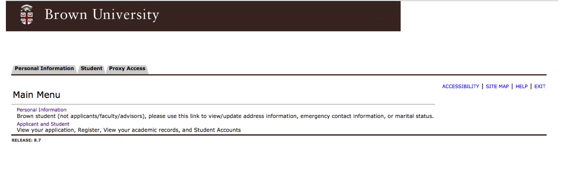
This is a screenshot of Self Service as it appears at the time of posting. Notice the redundant link and tab for “personal information” and the confusing smallcaps links to certain actions on the right hand side.
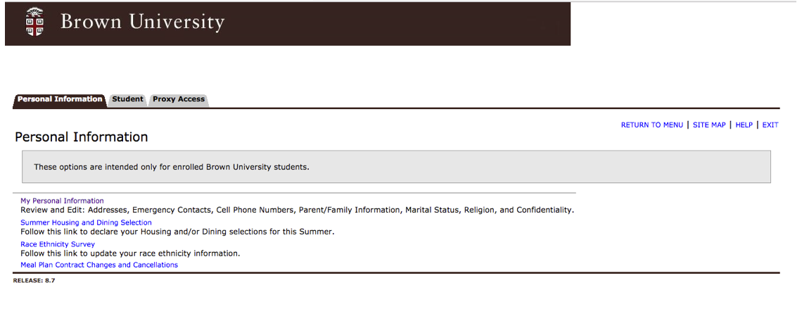
Note the confusing message displayed to the already logged in, active Brown student. Space is taken up by a summer dining link which should be conditionally displayed based on the time of year.
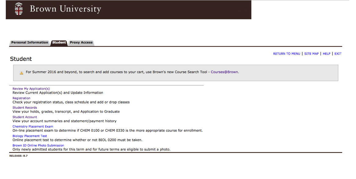
The “review my application” option links to a page telling the user they have already been admitted to Brown and can’t access the page, which is intended for prospective students to check their admission status. Placement tests are given separate links and take up space even though they don’t apply to all users.
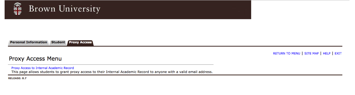
An entire tab devoted to one option doesn’t match the user’s expectation of a tab holding multiple related links/entries.
The Solution
My redesign of the online portal is not a vertical (in-depth) reinvention of the tool and individual interactions, but rather a broad horizontal proposal for a more effective navigation and page body design. In essence my design simplifies unnecessary options and does away with cumbersome links, replacing them with metro-style tiles for easy selection with touch or mouse input.
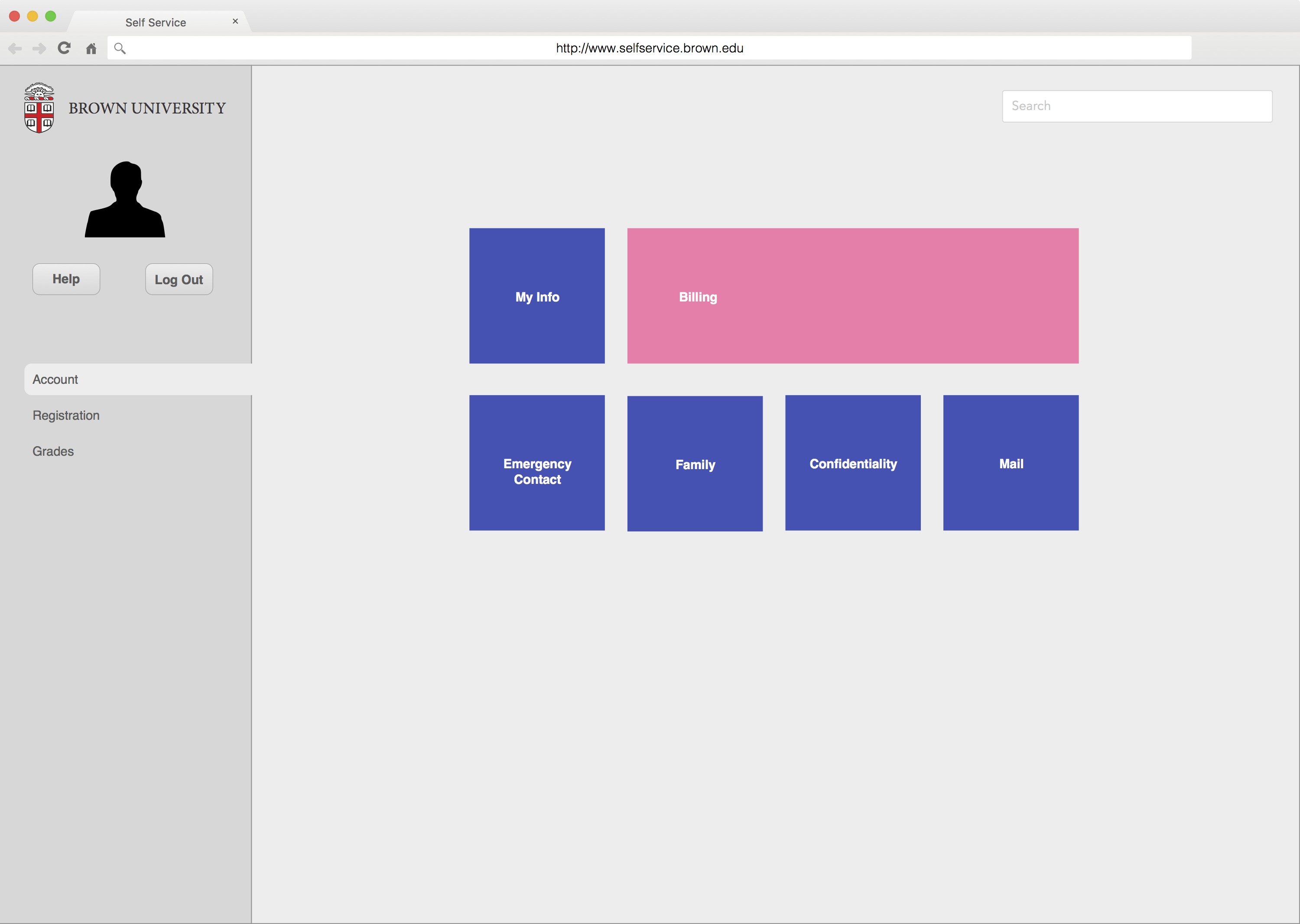
This redesigned account page is the first thing a user would see upon logging in. The user is given a guiding left sidebar, search bar, buttons for “help” and “log out” and color-coded tiles. Tiles of similar colors represent similar actions.
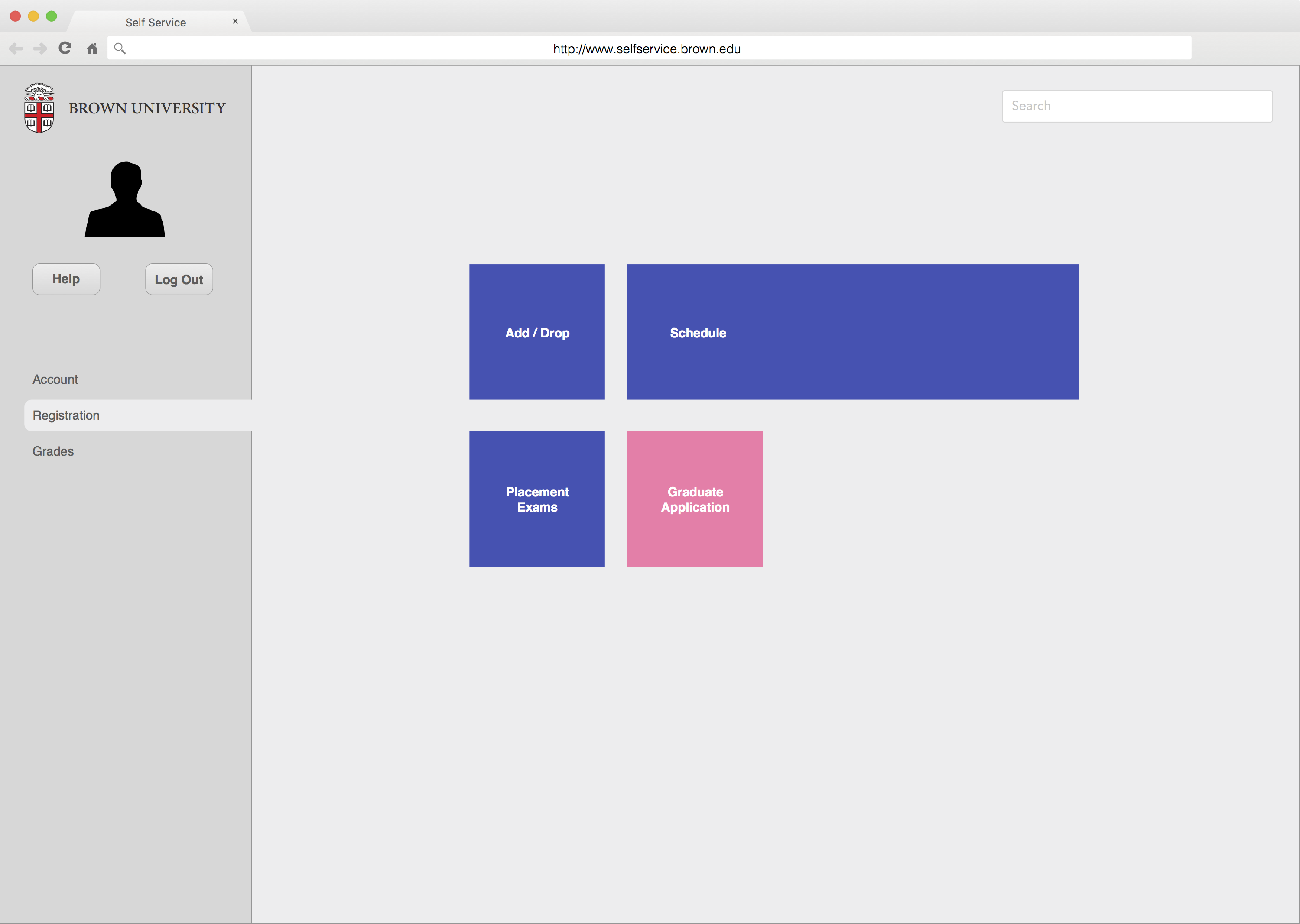
The registration page maintains the same navigation elements (search bar, log out button, etc.) while simplifying the options of the current interface. Once again color-coding is used to callout associated tiles.
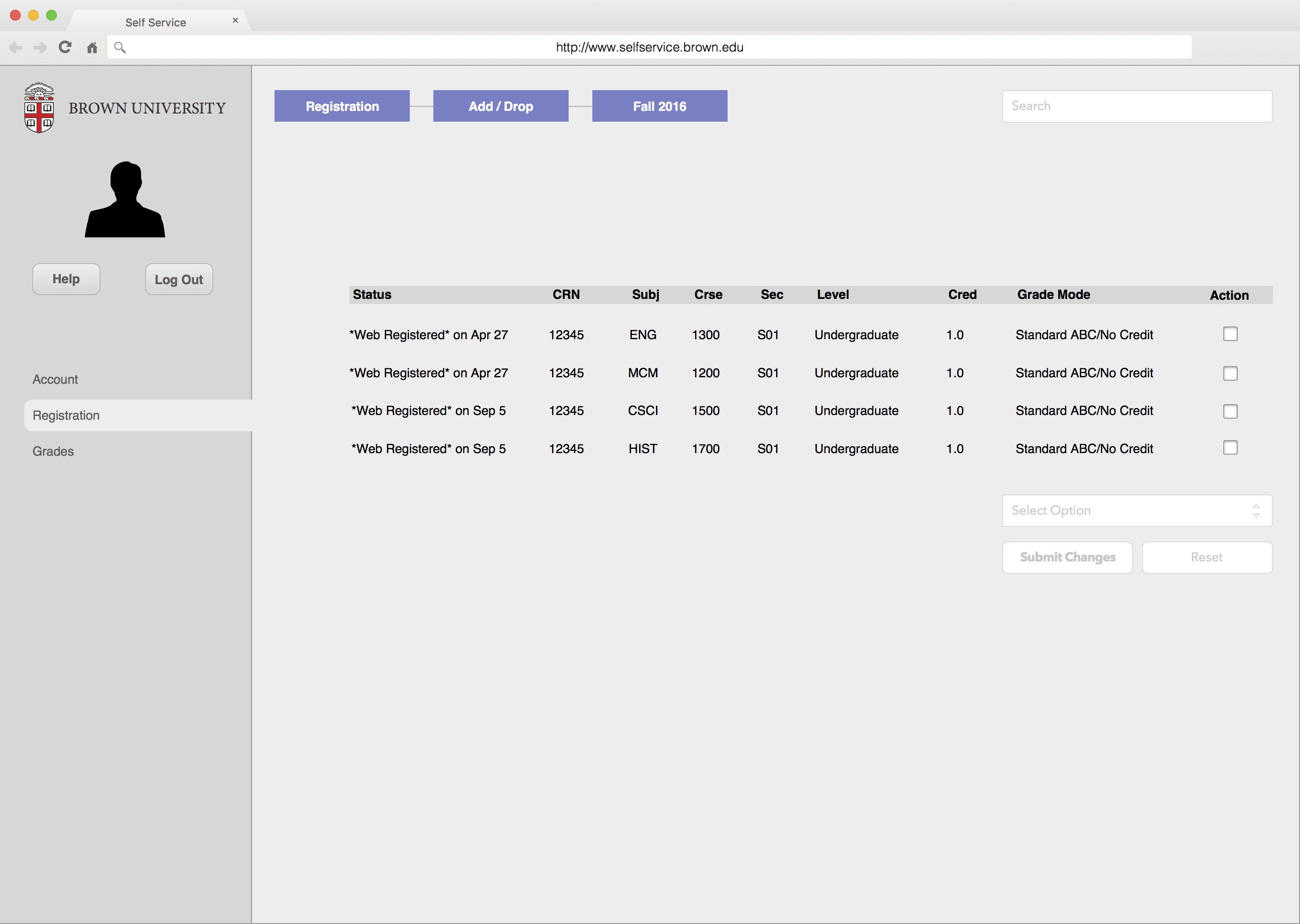
This mockup demonstrates a more “vertical” redesign, illustrating the navigation breadcrumb which would appear at the top of the page as the user navigates beyond the colored tiles.
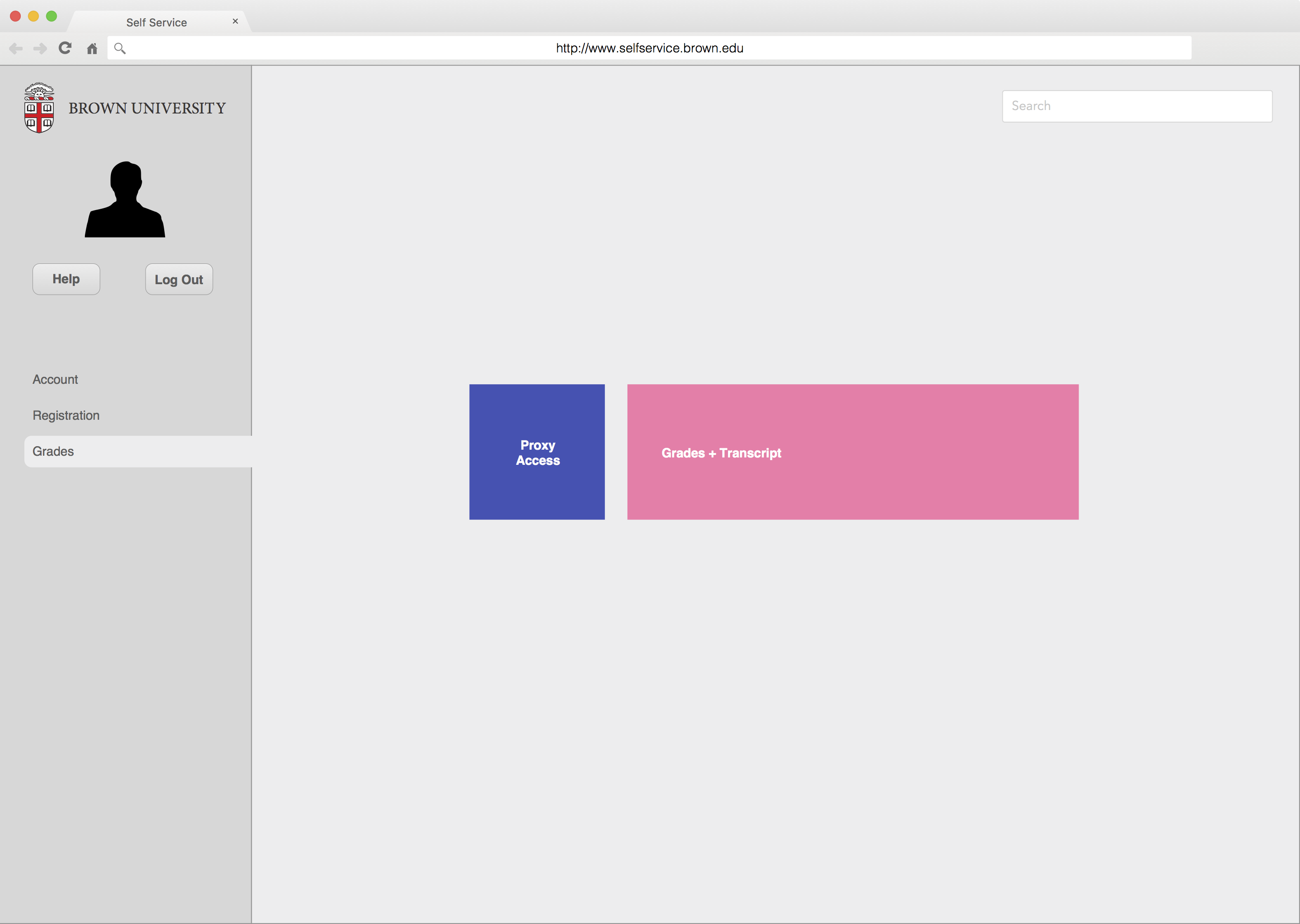
The grades tab takes “proxy access” which was once given its own tab and nests it with “grades + transcript” which is what the user would give another user proxy access to. This redesign compresses space and more closely aligns options to the user’s mental model.